Friday, April 22, 2011

Conversations with Dan McNulty in Jersey City


Conversations with Dan McNulty in Jersey City by Andrew Blaize Bovasso (a link to his blog.)
He'd take images from this book...


Bovasso basically took the images from the Jersey City 1940-1960: The Dan McNulty Collection (Images of America series) rephotographed the locations at its current time and overlayed the two images. Some on the images are extremely sucessful at portraying the cycle of gentrification and how the buildings are reused/rebuilt/abandoned/demolished. 


The photo above shows the Palace Theater and its current state of non-existence. The combination of the two photos give us a ghostly sense of what was and what is. 


His Blurb Book


I wish he had a website. He only has the blurb preview and a blog that is not easy to navigate. I don't know a lot about Bovasso, except he graduated from MICA with a BFA (maybe in 2009?)


However his photosread with a clear intent (whether he intended this specifically or not.) His pushing the "before/after" shot by combining the two make it much more interesting and relatable to the visible cycle of the building/neighborhood/street.


Sunday, April 17, 2011

being with

In Roydson's Untitled, She uses layers of her exploration into
Wojnarowicz, which layered into his exploration of Rimbaud. 
This week's reading touched back on a lot of old artists such as Joan Jonas (Delay delay) and David Wojnarowicz (Arthur Rimbaud in New York)

As well as new ones like Sharon Hayes, Ginger Brooks Takahashi, Zoe Leonard, Emily Roydson, to name a few.

A lot of the artists were being with the city and their interaction with the city. Their response to the city which has been perceived as "living." Some of the artists work related to the definitions of "I" and "we"
("We" not always being person to person, but artist/viewer to building or surroundings.)


Monday, April 11, 2011

the last lights on Cabrini Green

photo: l.baldeshwiler

Last Monday I decided to check out the Cabrini Green art project. Living about 29 miles away (from Cabrini green) and being later in the evening to travel alone, I jumped in my car and headed up to Chicago. 

When I began I decided to try to document my journey up to the project. I was amazed at what I found in the video afterwards.

The video starts in a suburb. It can be any suburb really. Take main street along the cookie-cutter houses to a commercialized drag of IL83. We pass a Burger King, Walgreen's, Dairy Queen, McDonald's... Past a car dealer with several of the same exact cars and get on the expressway. Go north, up the great divide and off at Division. Pass over two bridges and Cabrini is on the left. 

I can see the lights from before the second bridge.

I pull around the block and sit in the parking lot and watch the west side's lights flicker. It’s somewhat hypnotic with how this silent building can be screaming with the lights.

I felt really irresponsible. As being a person from the middle working class that hasn't really had (financial) struggle in my life, or has ever suffered neglect from the government (housing wise)- I felt rather off driving 60 miles in total, (which cost me 12 dollars in gas,) to look at the last building of an era of neglect and abuse. 

The artist was successful in creating a dialogue of what we prioritize. 

I am more aware of how good I really have it. I have enough cushion to live in a suburb and drive anywhere I need to. Spend thousands of dollars on post-high school education and equipment. Only to gawk at the dilapidated building of people who didn't have anywhere near as nice as I did. (Just this week my laptop died- within the next day, a new one was on the way….)

And what for? We have become aware of the slumming/unslumming process. Examining who is charge of city planning and unslumming is not the person who has experienced the slums. It’s another person of a similar well enough to do background.

The removal of Cabrini Green may have brought some property values up in that area and also may have lowered some of the crime rates- but I’m sure I’m going to be watching the same cycle- just another day and another neighborhood.


(this video may be choppy. I felt Greenday’s Welcome to Paradise was somewhat fitting of the music I know. If not, mute...)

Sunday, April 10, 2011

Made in China


First off- I read this all last night and found it hard to relate without being too opinionated. I figured to wait it out a little and see what the other blogs had to say.
I find it difficult to relate to a country that I’ve never been to that has a different political system than ours. And also has such a restrain on what information that is being passed on to the rest of the world. They’ll stop filming from happening in places that would make them look like a lesser super power. Artists still found a way get their view across.

For example- the 2008 Olympics was an attempt at fairness by allowing the people to have “protest-permits” but were ultimately denied or detained in attempt to silence them.
“Two elderly women from Beijing, aged 77 and 79, who applied five times to protest during the Olympics against what they believed was inadequate compensation for the demolition of their homes in Beijing in 2001,[124] received a suspended one-year non-judicial sentence of re-education through labour for "disturbing the public order".” –Washington Post

Also- the doctoring of fireworks was an attempt to make a larger display to show off China’s “progress” (whatever that may be.)

“As the ceremony got under way with a dramatic, drummed countdown, viewers watching at home and on giant screens inside the Bird's Nest National Stadium watched as a series of giant footprints outlined in fireworks processed gloriously above the city from Tiananmen Square.
What they did not realise was that what they were watching was in fact computer graphics, meticulously created over a period of months and inserted into the coverage electronically at exactly the right moment.
The fireworks were there for real, outside the stadium. But those responsible for filming the extravaganza decided in advance it would be impossible to capture all 29 footprints from the air.” –London Telegraph

Freedom of press coverage was also promised, but not delivered. There were to be no live reporting from Tiananmen Square for fear of rioting and protests.
The readings and info for this week…
Youtube (1 and 2)-
Tiananmen Square Massacre with the gunshots was just like the heads being bashed in from behind. Only the army had the guns. “Might of the state”

“Cameras in others hands are dangerous.” You can portray the truth as you want it or show the truth in general that may not want to be shown. Again the “might of the state” monopolizing what is to be shown to the public of the protests happening inside the square. This was getting out of hand of the government and they didn’t want this embarrassing moment to be shown.
Again, they (the state) didn’t want to be perceived as weak, or as failures. 


Reversed Images: Representations of Shanghai and Its Contemporary Material Culture and Contemporary Chinese Art-
An awesome array of artists that followed what they wanted to say and made their art through photography, collage, graphic design and other media such as texture rubbings on buildings to be demolished.

Dateline’s Ghost city and the Made in China-

Showcasing the economic growth but how it’s an empty shell that could possibly be a horrible collapse of the market. 

Sunday, April 3, 2011

their aim has not been to reform life but to know it. (week 10)

Atget's way of documenting
Two-Way Street by Lydia Yee uses strong key words like natural evidence and live witness to compare Atget and Cartier-Bresson’s photographs. But these can be pushed throughout the article with the archive, portrait and performance pieces (and their artists.)

Nikki S. Lee
This article was jammed with artists that used the street as their primary canvas for their art and used photography as their recording technique and information medium in order to record their ideas. People of the street being followed and photographed and performances that use the street as an identifier. Nikki S. Lee embodied several different “classes” and explored those regions. From senior citizens, to punks, tourists and Latinos- she fit in with the groups well. Her success was illustrated by the photographs. These groups/projects all have a largely recognizable public establishment. Her photos with the punks weren’t as if we didn’t know what that group was- we knew who she was trying to be because of the public-ness of the cultures.

“The simultaneous recognition, in a fraction of a second, of the significance of an event as well as of a precise organization of forms which give that event its proper expression.”
(Cartier-Bresson)


New York Groove - Daniel Guzman. Pretty awesome song to put this street performance to. 


Amy Arbus
Friedlander’s “series of self-promotion pieces might be seen as a kind of performance piece.” All street photography could primarily be classified as performance because of the act of flanuerism that the photographer engages in to find and follow the specific subject that interests them. Amy Arbus photographed the people that interested her- so did Jamel Shabazz (so did practically everyone.)

"The streets of the city are constantly changing, providing artists with a continuous source of images and ideas. In the century that separates Atget’s rue Vielle-du-Temple in Paris and Leong’s New Street in Beijing, daily life on the streets has become extremely complex — serving not only as thoroughfare for pedestrians and vehicles, commercial zone, and public space but also as cultural, political, social, domestic, and private space. While the street and its uses are transformed, contemporary artists continue to reinvent the possibilities of the street, crossing the median between traditional artistic genres and contemporary practices."
Shabazz

In Karen Jones’s article, she starts by defining potlatch as the exchange of gifts eventually leading to the value of materialism not being able to be topped and then the destruction of their own property in order to make the value of the other’s go up. (From what I understood the “chief” of some culture did and its events that occurred in result of.)

She then goes to say that riots and potlatch have similarities as the shared community interest. I didn’t quite understand what she meant comparing the two, but I think she was trying to say that the community as a whole gets to a boiling point and will together act in unison. Hoping to achieve a common goal.  Unless it was like a negative potlatch. The government gave them small shitty things and they rioted in order to have a bigger mess? Degenerative?

Winning.

Keith Haring
The next section of graffiti gets a little clearer. “The graffiti artists utilized public space both to comment on access to elite institutions and as a means of rupturing social order.” They’d graffiti in subways as a medium to communicate with a vast number of people.  The story of how Keith Haring started because of the empty spaces looked like chalkboards and an open invitation to create.  

She describes the cycle of the artist’s struggle within their community. They’ll have a message, it becomes harder to convey the message, they try again in new and different ways, they still get knocked back- but they keep trying to figure out to gain their status and that their voice counts. 


CIRCA clown army - I found this on CPA and found it fascinating. They use this mob of clowns as a protest and manage to get some sort of a point across. (i'm at a loss for what the point is now- but it was started as a protest of a visitation of George W. Bush to the UK)

Sunday, March 27, 2011

never dogsit a 9 month old siberian husky. nothing will get done except the destruction of your house...

Shifting ground
In Shifting Ground, Frazer Ward says that streets have anonymity and the physical street as a highway, not necessarily a highway but a network for information and people interaction.

The decollage went to the street to reclaim a form of specifically public expression. The ads were meant to be public when they were first put up. So for it to be reclaimed and then to be affixed on the street anonymously, just as they were first put up.

“The experience of the street was conditioned by the images and various forms of publicity.”  

Ward mentions that Moses was a czar, which was humorous but true. Moses didn’t care about the people using the space quite as much as how much he can get people to move through the space quickly.

Ward introduces fluxus. I honestly was unaware of this until now, however it somewhat links in DADAism.

Fluxus—a name taken from Latin word meaning "to flow"—is an international network of artists, composers and designers noted for blending different artistic media and disciplines in the 1960s.

In Yoko Ono’s Rape, a camera crew follows a woman, Majiate, through her time and basically chases her into her apartment. "No one in the street appears to pay the slightest attention to her plight.”

George Maciunas Manifesto
This adds to the anonymity of the street. The film “represent(s) the street as the site of disciplinary surveillance, which, in pursuing Majiate into her apartment, obliterates the distinction between public and private realms.”
Ward was careful when he juxtaposed the two words “Voyeurism/surveillance” the juxtaposition of these makes

There are thousands of people on the street and the entire duration of this woman is being chased, no one seems to care.

“The conceptions of the street that evolved from the intertwined phenomena of protest culture and counterculture.”


FLUXUS TANGENT  an article by George Macuinas.


Powers of Removal

Lytle Shaw Spans a few things from performance art that may possibly fit as fluxus to a more contemporary version of flaneur. 

“Afterwards, outside, again and again. the powers of removal struck me as looming awfully… the newest mass of multiplied floors and windows visible at this point. They ranged in this terrible erection, were going to bring in money-and was not money the only thing a self-respecting structure could be thought” Henry James’s film, illustrated the reconstruction and reuse of space to transform what we use it for. James points out in the writing of his piece that the building upwards is horrifying.

“de Certeau's previously quoted "Walking in the City, "In the dream of vertical ascent and hovering flight, we glimpse the cartographer's view, a fictional disembodied eye suspended high in the air. But as soon as we follow one line, or one river, and not another, a journey emerges” He describes what would be paths and borders. Recognizable landmarks that we orientate ourselves to get through the city.

Jimbo Blachly's About 86 Springs. Blanchly explores a guide to the springs of Manhattan from 100 years previous to his exploration.  The result is a remapping of the city through the medium of the walk a remapping that combines the kind of urban taxonomy mentioned above with a more explicitly perlative dimension. As de Certeau says: "The long poem of walking manipulates spatial organizations, no matter how panoptic they may be."


Adrian Piper, Mythic Talk
Adrian Piper's Mythic Being explores the deliberate anonymity of an androgynous but more masculine figure navigating the city through a type of performance art. She would then take the photos from when she was out and create drawings from them.

Sunday, March 13, 2011

Chicago


The Pacyga reading basically was giving an insight as to the influence of the Daley (the 1st one) mayoral reign on Chicago. While doing some good things, like greatly improving the highway system (at the cost of underrepresented minorities) some things did get away from him.
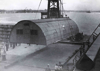
Quonset- similar to some of the temporary
housing the CHA enacted. 
The Prudential Building paved way for the development boom in the loop. The economy was on its way back up because of the war and with the excess of people there was a need for improved and increased housing. The Chicago Housing Authority was established which began phases of its housing for war workers, veterans, and low-income housing. It started with three and four story row houses and two story row houses. Then it went to townhouses, and then to the high-rises.
“Rows and rows of houses constructed during this period seemed like army barracks.”
The (racist) white people were voicing their concern with having African Americans living too close, which caused the beginning to the white flight and that “Chicago might have kept costs down and high-rises to a minimum if land on the outskirts of the city had been available.”  

 
Robert Taylor Homes (Dan Ryan in upper right corner)

Because of the development of the suburbs, Chicago was choked into the space it was currently occupying and that was all it could have.
The construction of the highways added to the racial divide on the southside. More specifically, the Dan Ryan. 
Richard Wiser, in regards to the highway system, “its not at all well designed.”
I drive the Dan Ryan every time I go to school, and I agree with Wiser. The traffic is terrible and I can only imagine how stopped-up it was back when it first opened.
September 28, 1969 - CTA service begins in median strip
of Dan Ryan Expressway. 

When it comes to the riots, Martin Luther King wanted to use Chicago as a northern state role model. Unfortunately the racism that was being shown towards the blacks was heartless, it reached a boiling point. “exploit, distort and ridicule [the African Americans.]" -Medium Cool. That’s where we can weave in the scenery and themes from Medium Cool.

Medium Cool
First off, I’m concerned that the 13/15 parts of Medium Cool on youtube was either edited in adding new or changed sounds and some of the sequences didn’t seem to fit at all. But that might the nature of the film.  The further I got into it, the more I got annoyed. The riot scenes seemed ridiculously faked. One part was missing sound and  the A.D.D. moments were hard to keep up with. But I feel I got the basics of it, with mentions to the riots of 1969, the depressing state of the school systems, the censorship of the media and the racism. 

The Cahan reading was more about the physical shifting of the buildings. Either how they fell into disrepair, was degenerated into “lower” uses (beautiful storefront into laundry mat) or demolished despite its architectural beauty. The reading centers around Richard Nickel and his photography life as he documents buildings as they follow the changes with the city. He recorded what they looked like at the fraction of the moment as they slid into their own depression. 


Sunday, March 6, 2011

Los Angeles


Pop L.A.
The view from the car
detail of Back Seat Dodge '38. Ed Kienholz 
This reading touched on a lot but mostly staying centered around the car. Los Angeles boomed with population and in result of poor urban planning, it just sort of plopped outwards. Because of this poor planning and little to no central hub the population used cars as their main source of transportation. This was also while the car itself was being pushed past its mass produced uniform look and was being customized. This attracted artists to focus on the car as a symbol and a vessel for transition and momentum.

Illegal Operation, Ed Kienholz
Directly relating to the people of the city; “(Edward) Kienholz, often motivated by anger, outrage, or a satirical impulse to explore highly charged topics ranging from illicit sex to illegal abortions, summoned forth passionate responses to his art… … At the same time the theatrical staging of the private in public and it’s monitoring by the museum inevitably made viewers aware of their own voyeurism and sexual desires.” Kienholz’s sculptures and art demanded the viewers and museum higher-ups directly. An attempt at censorship, failed, was a great examination on the public’s realization on their voyeurism.
Where does the museum as a “general” ambassador get to draw the line of what is to be viewed by the public or not? If its protecting some of the population, then put up a warning sign not to see it, after all- some people don’t even like driving past strip clubs or adult bookstores, while other people see that its no big deal.


Watts Towers (flickr artist unknown)
Artists in LA greatly reacted to the car culture. A number of projects either centered around the car or shot from a car surfaced. Celmins’s freeway drives, Ruscha’s typology of apartments, gas stations and Sunset Boulevard transformed these “urban freeways into landscapes.” But drew attention to the commercial landscapes built around cars. In the Banham video he traveled everywhere via car, noticed all of the signs directed at motorists, talked with artists who use the car as their mode of transition on their art.  
Based on the car culture alone, I feel the city itself is getting a little lost. LA as a city was said to “break all the rules” because of the business buildings being thrown on top of the residential districts. The artist with the plastics said he feels like he could only do that work in LA because of it being LA. That the city “gives him a mechanism.” The interview in the car at the drive-in, Banham mentions that he there are no monuments for people to locate and guide themselves through the city. Ruscha’s solution mentioned drive-ins, car washes and car related businesses and nothing that is a physical landmark, (more of a commercial landmark or nodes where you relate “this is where I wash my car”) like the Willis Tower, World Trade Centers, etc. the walkers in this interview and first reading were ignored.

The walkers are better addressed in the Allan reading as “spectators.” They’d participate in art walks and flood the streets. “Ruscha’s paintings could only benefit from the heightened awareness of the spectator as a pedestrian, with a mode of vision conditioned by the fundamental reality as well as one shaped by the free-way centered lifestyle in Southern California.” Allan mentions that there is two ways of seeing a painting and I’m guessing this would be if you are used to the high-speed movement on the freeway or if you’re not.
(this reading helped me relate as a person walking in the two books instead of being in a car, although the Sunset book is specifically shot in the middle of the street)
Addressing the space Ruscha illustrates in his books (Sunset and Apartments) it’s more of the spastic relationships the buildings have with each other along with the streets that make up the photographs in the book. That the users of these spaces were the ones intended to be using the books he made of those spaces.

Jumping back to Banham’s film. He made a great mention on Venice Beach and the Pacific Ocean Park and how they were to be un-slummed. The voice on the fictional car tour said that the new plan for POP and Venice Beach was that of some expensive yacht club neighborhood. His vocal reaction interrupting the narrator on tape “Where will all those people go?!” is the same that Jane Jacobs mentioned in her slumming/unslumming reading. Urban planners have these big ideas for the first part of their plan but when it comes to the residents, they fall short and don’t plan for them.

Sunday, February 27, 2011

New York

Action around the Edges
The Douglas Crimp reading was about his neighborhood, and living in New York, experiences. He relates how he didn’t move into certain neighborhood because of how he felt they were “rough” due to it being mixed use (of industrial and residential.) This is about after the time when developers were trying to “de-slum” areas of NY. This lead way to Gordon Matta-Clark’s works with the abandoned structures- “Work with abandoned structures began with my concern for the life of the city of which a major side effect is the metabolism of old buildings. Here as is many urban centers the availability of empty and neglected structures was a prime textural reminder of the ongoing fallacy of renewal through modernization”

 
The city had several ways of using these abandoned buildings, whether it be demolishing them for bigger and better buildings, re-use or even cruising.
Crimp makes a fantastic point “cruising- is feeling yourself alone and anonymous in the city, feeling that the city belongs to you, to you and maybe a chanced-on someone else like you- like you at least in an exploration of the empty city.”
Cruising in this context doesn’t even need to be looking for gay sex. It seems as if a new version of flanuer- but instead of watching people the point is to be alone (if you encounter sex though, its like a bonus.)

I encountered this video from the show 
"Mixed Use Manhattan"- curator video that Douglas Crimp and Lynne Cooke curated.


Sidenote...
Between Alvin Baltrop's photographs of pier 52 and Matta-Clark's "Day's End" is slightly removed from NY but still shows the phenomenon of the anonymous gay sex. (also recent masters graduate Jennifer Ray "go deep into the woods" www.jenniferray.net also illustrates this.)


Martha Rosler-


This reading makes points about how post-war bombings cleared the way for Europe to streamline transportation, clear out small old buildings and fix narrow streets. America hasn’t seen an attack that easily guts out the old slum areas. Improving the lives of urban poor has been unsuccessful, and they have yet to find a real solution. Putting the houses and apartments in the citizen’s hands makes them more responsible and more dedicated to keeping their houses and streets clean versus “that’s someone else’s house, I don’t care” attitude. Rosler touches on class quite a bit. Through the middle class to the to the class categories of the elite and bobos (or bohemians.) Which there are several subclasses of. The class referred to in “Bobos in Paradise:” is the ones who are imitating the poor artist type as well as the hippie type.


Rosalyn Deutsche's Evictions introduction touches on what all of the essays are about. Written in a span of 10 years they can be broken into three interconnected categories that include: Analyzes the mutual supportive relationship that developed in the 80’sbetween the aesthetic ideologies and oppressive program of urban restoration. The second: criticizes the alliance formed between prominent urban and cultural scholars. The third returns to the question of public space and explore contemporary aesthetic debates. Deutsche goes on to summarize her essays and tells us more information behind the essays and other info that we might not have gathered from reading the essays themselves. She references the firing of the curator from the Hans Haacke exhibit.


She touches on a few artists and important debates that have happened in the art world, such as the Richard Serra’s Tilted Arc. She debates that “Art critics who want to defend public space should look harder at the question of democracy” But then goes on to refute herself in the “critical concept sphere” stating that art’s “publicness” depends on its universal use/enjoyment. Passerby simply got agitated by having to walk around this huge piece of metal and petitioned to get it removed. The common walker is not going to notice the “edge” this artwork is making and realize how this puts them in the environment- they’re just going to get annoyed. They did. And it was removed. 

(Richard Serra, Tilted Arc. installation photo)

Friday, February 18, 2011

jane jacobs


(demolition of Cabrini Green)

(security footage of a disturbance at Cabrini Green)
Revolt of the Urbs
This was a more captivating reading to me. The information that Robert Moses was using to streamline transportation and then trying to implicate with getting the middle class out to be able to use the highways for an escape is well thought. These streets were made when the middle class and poor didn’t go much anywhere. Now (more like the 50’s…) these tiny streets were getting more packed with cars and traffic. Moses was attempting to modernize and move New York forward. But because of old spaces of recreation, he was unsuccessful at getting past his plan of the highway through Washington Square Park.  
In the end though- I feel the park being left alone is a positive thing. Too often do people hustle and rush to get to work, back home, here and there- but rarely do we slow down and enjoy things. 


Jane Jacobs introduction to The Death and Life of Great American Cities, Jacobs makes the point of how slums stay slums and some depressed areas regenerate. Cabrini Green is an excellent example of how a slum stays a depressed suction and doesn’t necessarily “turn around” like developers hope for.


In chapter 2o Jane Jacobs writes about that projects seem that they are stuck in a perpetual state of un-kept depression. They can never be “improved” because they’re isolated from the districts they are in. reweaving the projects back is vital to turn them over from what they are. Planners need to recognize what’s missing in this equation and then supply it.
She goes on to point out that projects and low-income housing is poorly planned that lack diversity or lack conditions that generate diversity. Salvaging them requires specific attention. That the problems are more evident in low-income housing and affect the residents there.
“The silliest conception of salvage is to build a duplicate of the first failure and move the people from the first failure into the second while trying to salvage the first.”
She touches back on the importance of small blocks, public parks and streets that allow proper traffic flow.
The new streets need to tie into the streets beyond the project edges as well as tying into fixed features. The streets need to not be narrow, dark and dank. This will prompt the strong fight to not go there and maybe the quote from page 399 “Where can we go? Not to a project! I have children. I have young daughters.”
Children are also a big factor in this chapter. The projects have to be safe for them. There has to be a play-areas far enough from the streets for them. High-rise buildings don’t assure proper supervision for them. Apparently they pee in elevators in the projects. There are no doormen or guards to protect children from random predators.
There also needs to be cooperation from the people who live closest to the projects. They tend to be afraid of the projects and start border vacuums. Projects need to be reintegrated into the fabric of the city- be it “civic” areas or low-income or middle-income housing.

Friday, February 4, 2011

the navigators

      Edgar Alan Poe’s “Man of the Crowd” is about a narrator (writer) observing people walking from a coffee shop window in London. He describes in great depth how you can tell the certain “demographics” of the population apart, by either the clothes they’re wearing, the way they’re carrying themselves and how they’re standing apart from the others. Jessica Rodrique (http://jessicarodrigue.blogspot.com/) best described it “and the small details that the narrator uses to distinguish one type from another are photographic.” A line from Poe’s short story “Feeling in solitudes on account of the very denseness of the company around.” For this very reason, living in the city got to me. You would see thousands of people a day and not talk to one. This ties straight into Walter Benjamin’s reading. Public transportation is a common media where you spend minutes (up to an hour, or more) with people with no necessity to talk to them or acknowledge them. Along with that you have the opportunity to be the voyeur, or be looked at yourself. Along with public transportation there are arcades to be added to the public eye. Benjamin cites a poem To a Passer-by “Neither knows where the other goes or lives”
Which is another great example of the anonymous and the voyeur. Here the author (C.F. MacIntyre) is illustrating a narration of a figure who has seen a woman he is possibly interested in, but because of the disconnect and separation that we encounter everyday- this opportunity is lost. 

Look Down/The Robbery A street scene (and song) that I was reminded of in the Benjamin reading when he mentioned Hugo (who rote Les Miserables) ... just ignore that its a wee Jonas brother...


Anonymity of people slowly disappearing: “Photography made it possible for the first time to preserve permanent and unmistakable traces of a human being.” (Benjamin p.48) Although this is about the time when photography was more easily available, its not like you take a photo of ever person you ever see. Thus still keeping the overwhelming feeling of being alone with thousands of people around you.

Friday, January 28, 2011

week 1


Walking in the city
­In response to DeCerteau reading, I imagined the networks of the movements of the navigations of people as the different numerous routes I take to get to and from certain locations. When I take the train and need to get to the 600 South Michigan building, it’s a hurried pace, or frantic thread in the cloth of everyone’s movements. When I’m strolling up to Blick, it’s a calm leisurely stroll weaving between Wabash and Michigan being sure to follow my wandering mind of the other threads happening around me.  A city can easily be compared to fabric because of its visual aspect of its interlocking grid and also how the different threads rely on each other to hold it together.

Map-ola. 

Here is a visual example of a few various routes I take in the city. The red is my simple quick route from the south shore commuter train to the 600 building. The purple along LSD is how I get to the bars in boystown, the dark green is how I get to one of my sister’s apartments, the yellow/grey is how I get to the Chicago Bagel Authority from school (etc….)

This representation of the threads and how city dwellers exist in the arms of the city and make these beautiful connections unknowingly reminds me of Vivian Maier. She passed away with no recognition of her work until very recent. Her negatives were discovered and it was found that she silently pursued photography looking at examples and books from street photographers before her.

That awesome dog photo.


And the old lady one.


More of her work can be found here: http://vivianmaier.blogspot.com/


Lynch

I.
The image and perception is a fantastic topic. I will drive/commute to Chicago and it is always so small. The willis/sears tower is physically tall and the city itself is spatially big but because I grew up near Chicago, the city is always going to be a perception of a “tiny” place. This past summer I visited New York and the city in my perception is amazing and massive. The buildings (even at six stories tall) were giants to me. This mental image is going stick with me unless I move there and get familiar with that city for about two years.


III.
The public image and perception of a city gets categorized into five elements- paths, edges, districts, nodes and landmarks.


All of these work in a harmony of some sort. We navigate by all of these unknowingly at times. In my traveling description from the exercise in class on Monday the 24th, I used all of these to describe how I navigate my way down to Savoy, IL.